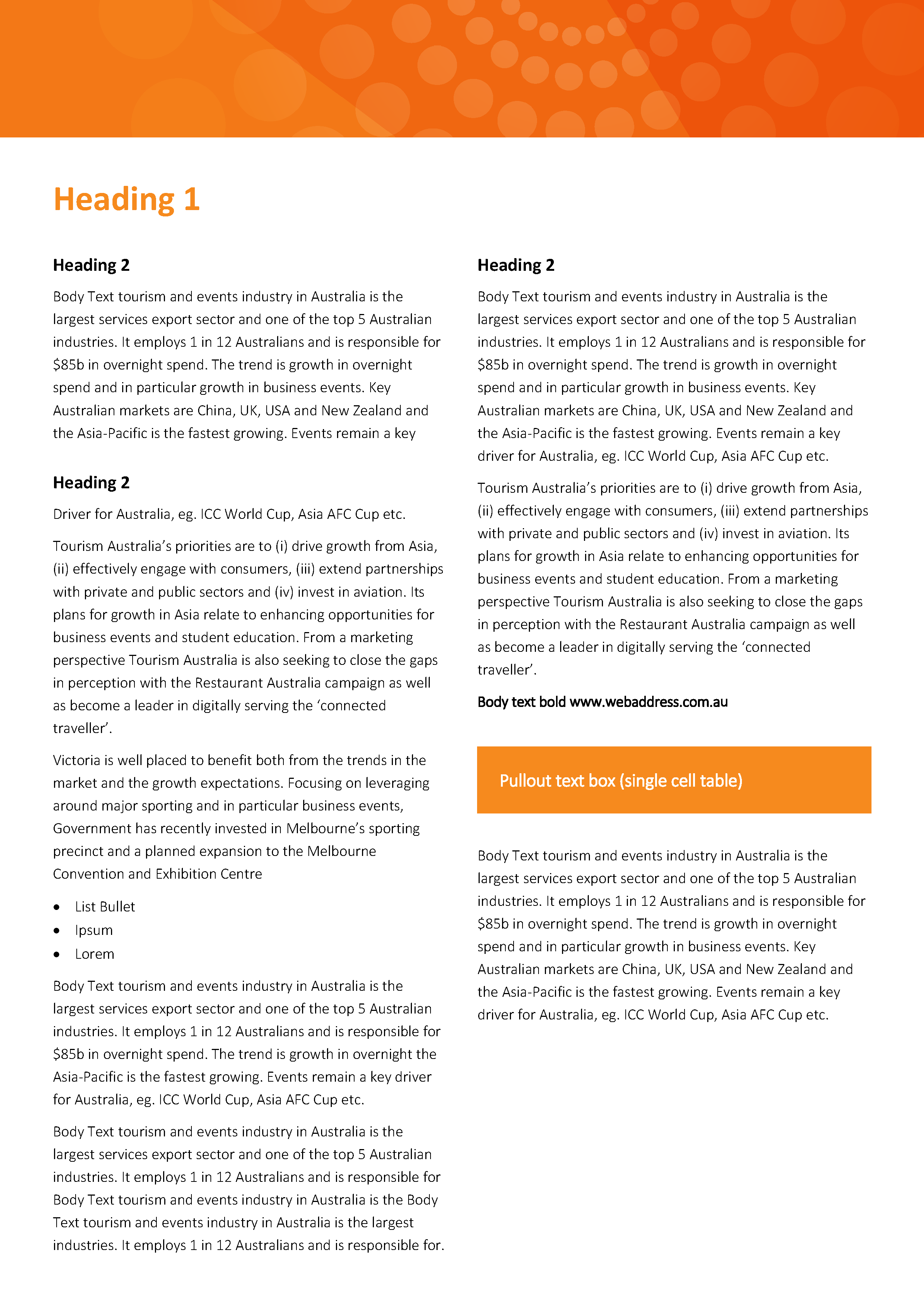
Photo-accurate translation of your design into robust, functional Microsoft Office templates and files.
Fluency in Adobe software and Mac OS means you probably find MS Office frustrating and back-to-front; different from what you know and out of your comfort zone.
I've worked with designers for years (in both DTP and corporate IT Support), I get design, I speak your language, we could probably trade horror stories 🙂
“translation”
Send me a PDF or InDesign package and I'll get Word or PowerPoint files as looking as close as they can possibly be to that design, working seamlessly for the client and saving you time and face.

What I need from you
Artwork for MS Office should be set up in RGB.
Colour specs should all be RGB. If you are using percentage tints, I need the actual RGB value to reproduce that tint e.g. 5% black would be something like 248 248 248.
If there are less than six colours in the brand, consider some curated complimentary colours for charts and smart art. Well implemented brand colours can do wonders. If you need more than six colours, lets chat. There are a few different ways to approach that.
A PDF of the final art will usually do, INDD packages are useful for more complex work but not always necessary. I generally don’t need completely separated assets, what are useful are page backgrounds in PNG or JPG.
Clear understanding of what is variable including photos and graphics, what should be a bit hard to change (e.g. office addresses or phone number set as editable text in the header of a letterhead), and what is to be completely fixed (e.g. a legal disclaimer set as a picture as a page background or footer graphic). Include in this whether you would prefer vector art or png/jpg; there are pros and cons with either.
PowerPoint art for screen or projector use should be set up at 19.05 cm high; 33.867 cm wide for 16:9 and 25.4 cm wide for 4:3.
PowerPoint art for printing (yes, sometimes people use PowerPoint for printed documents) should be set up using A4 or A3 dimensions.
Optional extras
Need more theme colours?
Having brand colours set up on the colour pickers in Office apps is great but there are limitations some clients run up against.
The colour pickers in Office apps have ten swatches available to customise, four of those are intended to be used for text or text background colour options and the remaining six are used for smart art and chart colouring defaults and options. These colours occupy the top row of the colour picker. Paler and or darker versions of the colours in the top row are then automatically generated in the area underneath the top row. Unfortunately it isn’t possible to edit these colours and sometimes these options aren’t really usable or are actually off brand.
When this happens, usually users need to manually enter RGB values which can be tedious and error prone. There is an alternative though.
Custom theme colours
Up to 50 additional colours (each with customisable hover-over names) can be added onto the standard colour pickers in MS Office applications, providing an easy way to set precise and consistent colours when there are more than six brand colours in use.
Custom Table styles in PowerPoint
It’s well known that you can’t create custom table styles in PowerPoint like you can in Word. When a specific table style is needed in a PowerPoint template, the usual approach involves copying a pre-formatted example table from a slide in the template. This approach is better than having to manually format a table but still has its limitations and pitfalls. Until now.
A custom default table style as well as any number of additional custom table styles can be set up as options at the top of the table style menu, each with custom descriptive hover-over names, making formatting new or existing tables much quicker and easier, much more consistent and flexible.
PowerPoint text styles anywhere
PowerPoint has text styles that can be set up but they are much simpler and work quite differently from Word.
In PowerPoint you don’t have a list of style names; title text placeholders can only be set up with one text style, text placeholders have up to nine styles available and those styles are accessed using the increase/decrease list level buttons. Most experienced users also know that text in tables, manually drawn text boxes and shapes defaults to 18 pt and needs to be manually formatted if something other than the default font size and style is needed – which is frequently the case. As a result of this formatting text in tables, shapes and text boxes can be inconsistent.
Something as simple as having the default font size be the same as what is used in the text placeholders would be handy. We can do that. We can go further than that too.
We can set up text styles for tables, drawing shapes and textboxes that work just like regular content or text placeholders i.e. up to nine styles, accessed using the same increase/decrease list level buttons.
Ready to find out more?
Drop me a line today for a free quote!
